

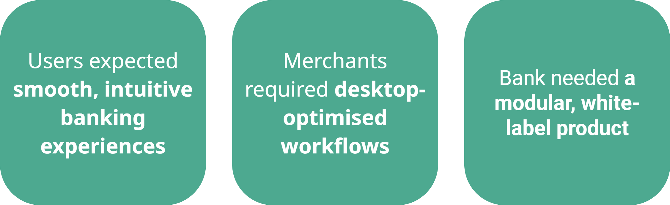
BCCPay, the financial institution behind BCC’s digital payments, set out to accelerate the digital transformation of its cooperative banks and deliver a consistent experience across channels.
As part of its evolution into Numia—now a national digital payments operator—the project focused on creating a scalable digital ecosystem that could be tailored to the branding and needs of individual banks.
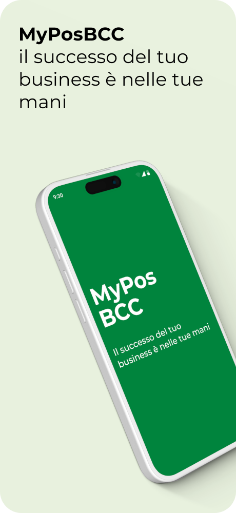
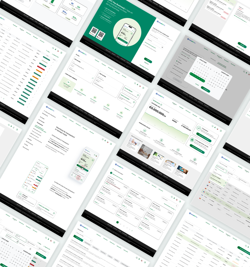
It involved designing a white-label modular mobile app (MyPosBCC) and a merchant web portal, empowering BCC banks to provide unified, device-optimized services while maintaining flexibility for local customization.
Upon 2 months of business analysis and concept development, we initiated the wireframes and the development of the design library, to end up after 8 months with the detailed design of UI flows and prototypes.
Our methodology followed the structure; Planning, organization, synergy, agility, working into sprints, structured analysis and design reviews.
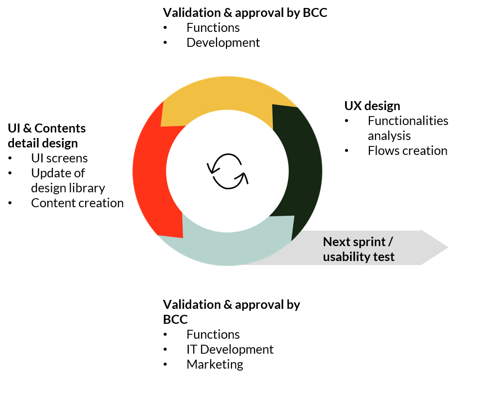
The graph above illustrates how we worked across the various sprints during the app development.
Research and strategic inputs gathered during the concept phase. Using these foundations, focus was on translating requirements into actionable UX flows and aligning them with the design objectives.
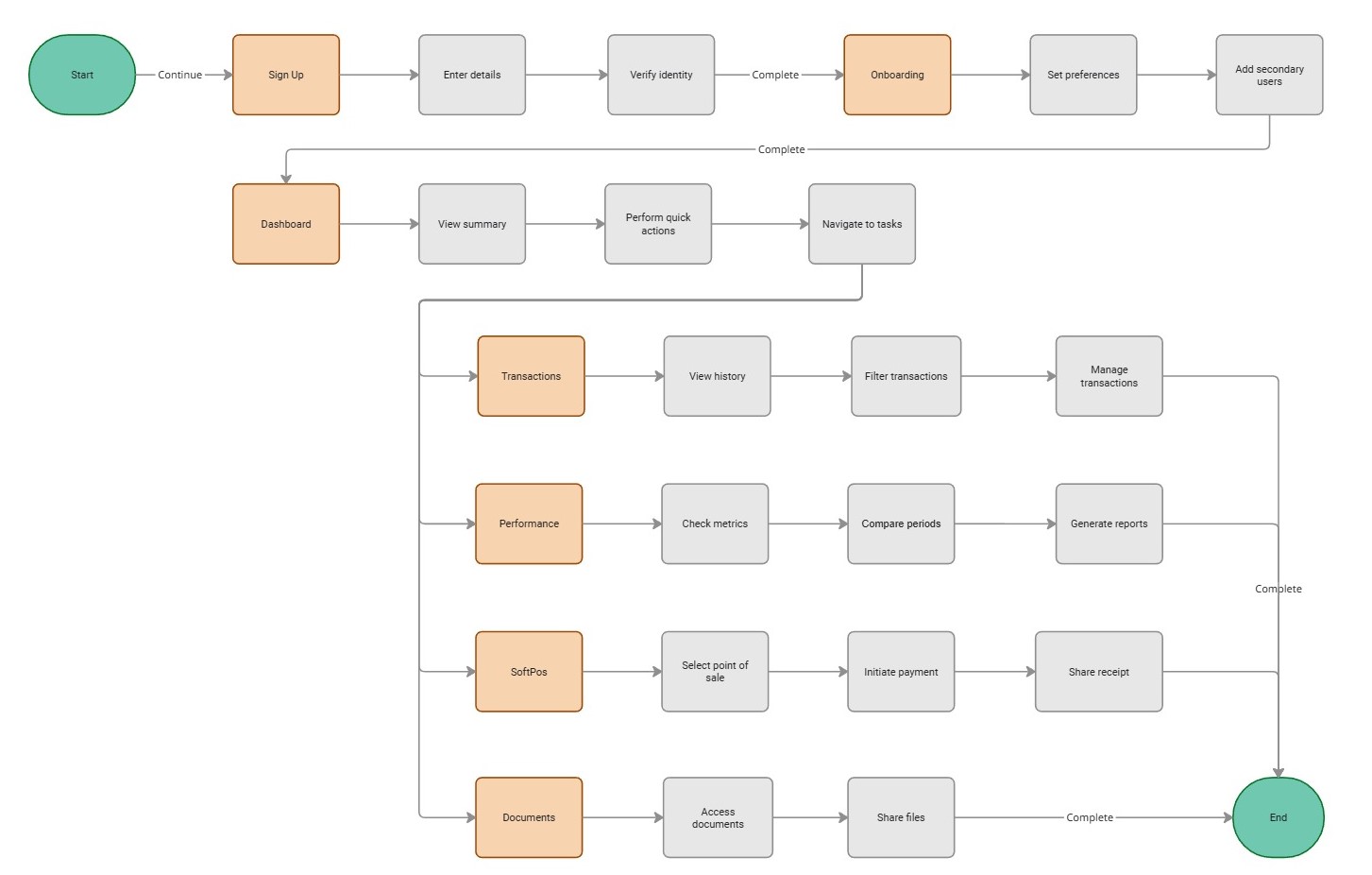
The initial concept (ideal user journey) was communicated to the client through a user flow diagram and wireframes. These supported alignment with the client’s Sales team and set the foundation for detailed design.

After conducting reviews with internal stakeholders, merchants, and various users, we identified three significant insights that became the main pillars of our work.
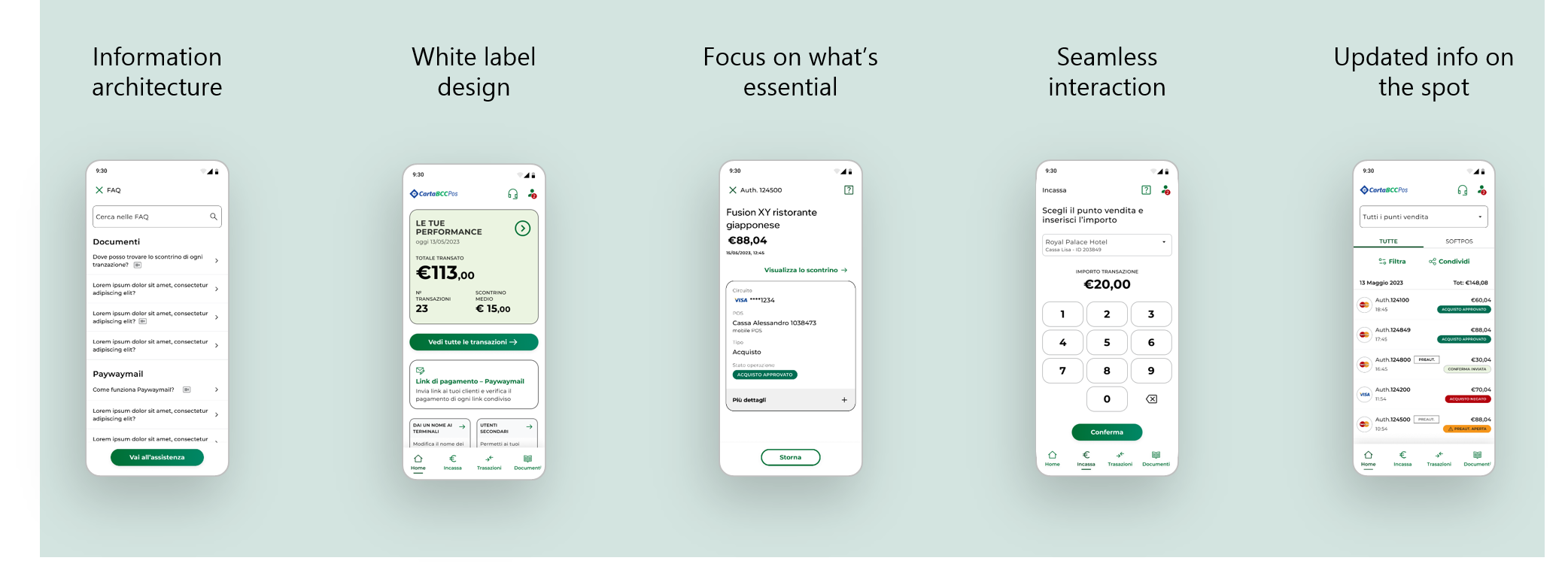
The app design was primarily guided by five design principles
1. Organize complex information
2. Keep the design simple to meet the objectives of a white-label product
3. Streamline information delivery to eliminate cognitive overload and support visual navigation, providing only what is useful to the user with clear graphic rules
4. Ensure ease of use and intuitive navigation
5. Back-end development – taking all alerts into account to ensure successful regular updates in transactions, performance, etc.
- Delivered multi-channel digital experiences (Mobile + Web)
- Ensured device-optimised UX for customers & merchants
- Supported BCCPay's scaling strategy with a modular architecture, and a well structured white-library design.
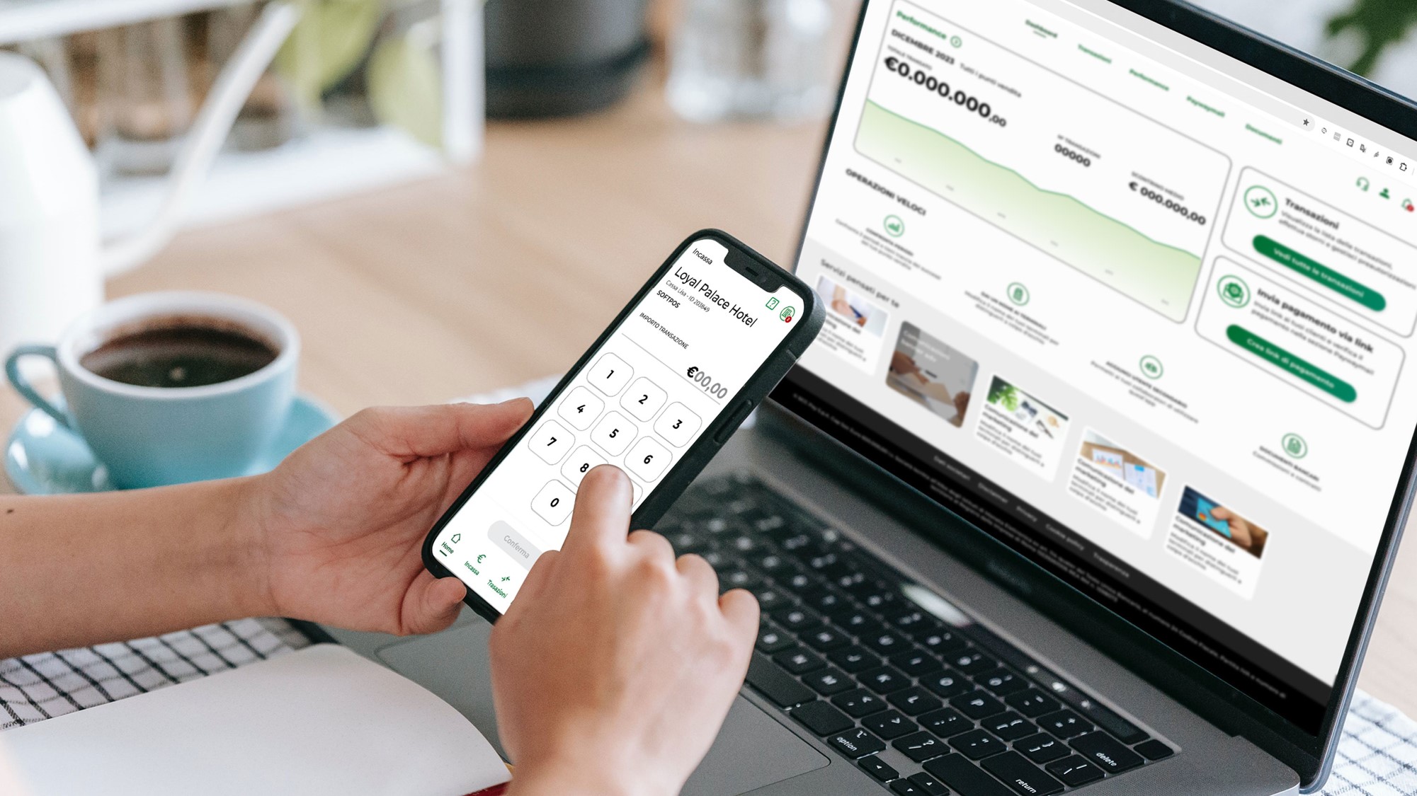
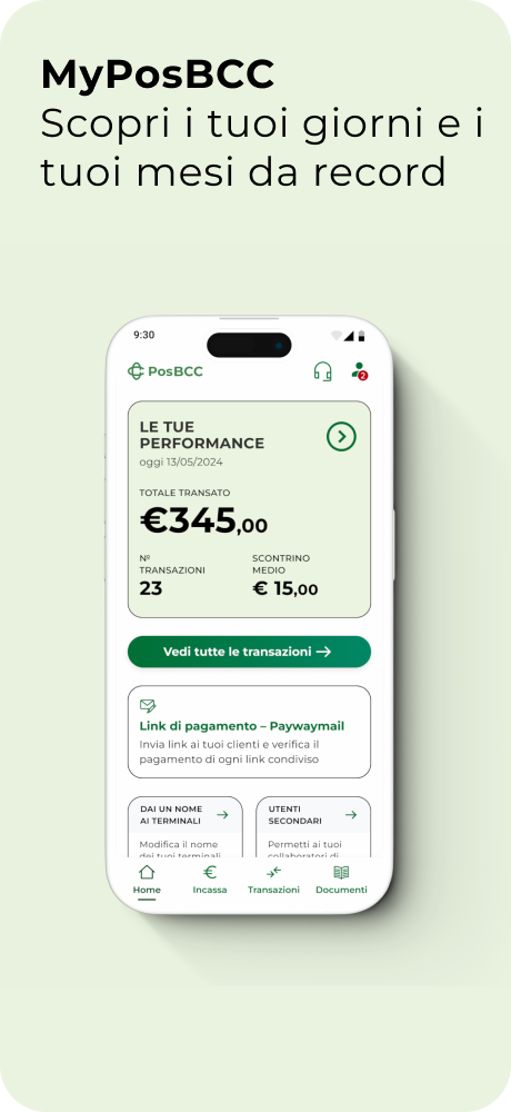
The BCCPOS mobile app was designed to provide customers with a seamless and intuitive digital banking experience, tailored to the needs of cooperative banks. Its UX focused on delivering quick access to core financial operations, including onboarding, account management, and transactions, while supporting white-label branding to align with the identity of individual BCC banks. The mobile interface emphasized simplicity and speed, ensuring users could efficiently manage their banking activities on the go.

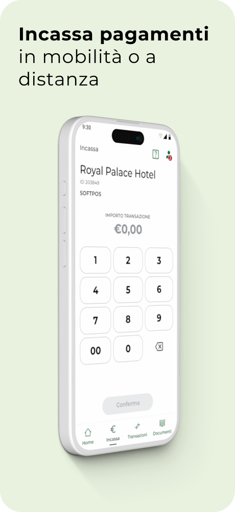
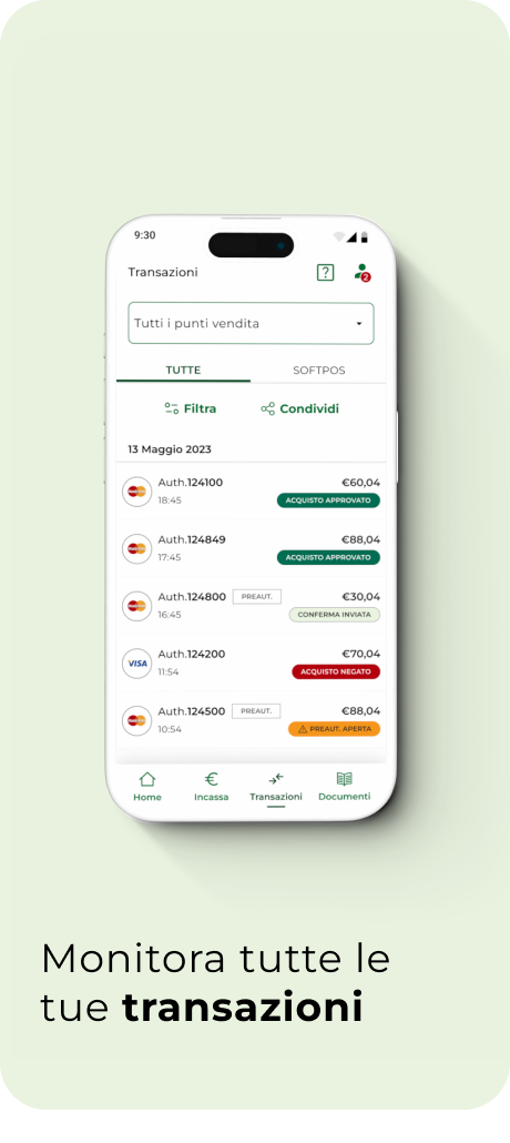
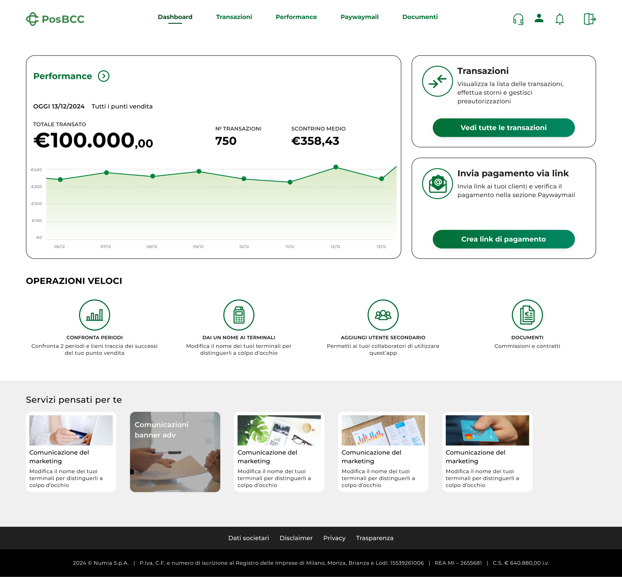
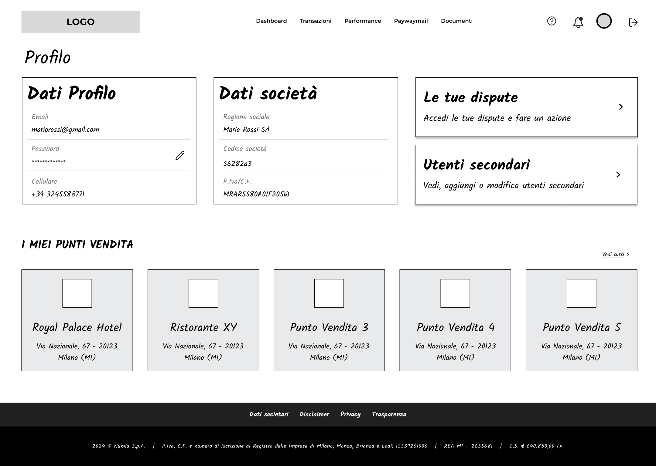
The merchant web portal extended the BCCPOS functionality to desktop, focusing on merchants’ operational needs. The UX was optimised for larger screens and workflows by removing mobile-only features such as Pay by App, introducing new capabilities like Paywaymail, and enhancing dashboard features for transaction management and analytics.
.png)
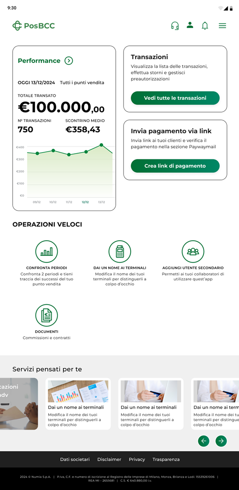
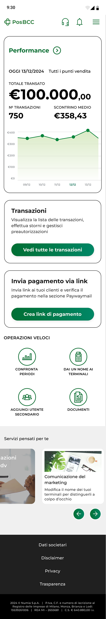
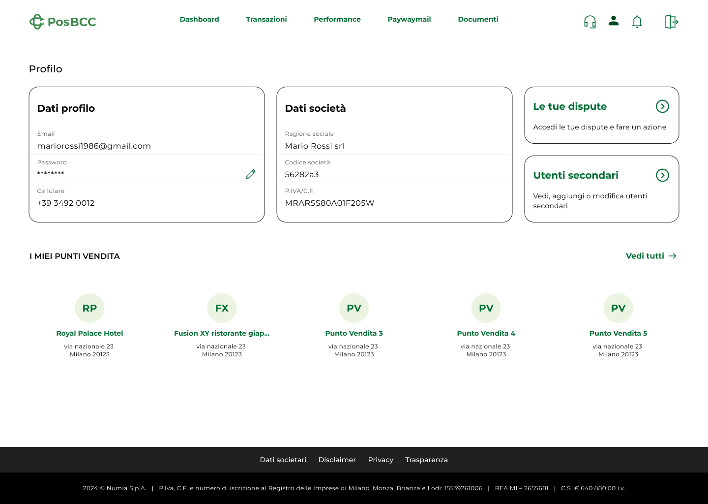
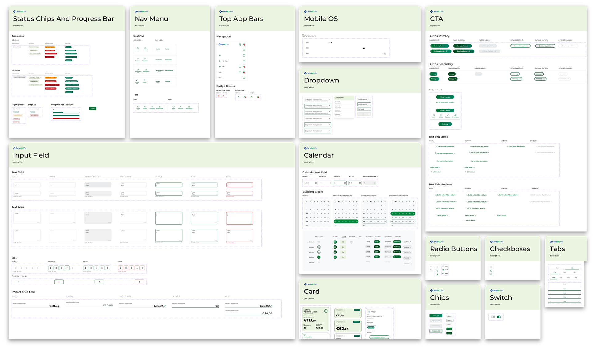
To support the scalability of the solution, a white-label design library was developed to centralize UI components, branding elements, and interaction patterns. This library not only allowed for quick customisation and a consistent user experience across all deployments, but also streamlined collaboration with developers, improving implementation speed and reducing design inconsistencies.
My role
I co-led the end-to-end UX/UI design process, and worked specifically on research and journey mapping to UX flows, wireframing, and UI design. I also shaped the service blueprint and white-label architecture principles, ensuring the solution could scale across multiple banks. For the merchant web portal, I adapted mobile functionalities to a desktop-oriented UX, collaborating closely with developers to align technical feasibility with user needs.
Outcomes
- Enabled faster digital onboarding for BCC customers
- Reduced implementation costs across banks
- Provided brand consistency with customisable flexibility
- Positioned Numia as a leader in cooperative banking digital services